

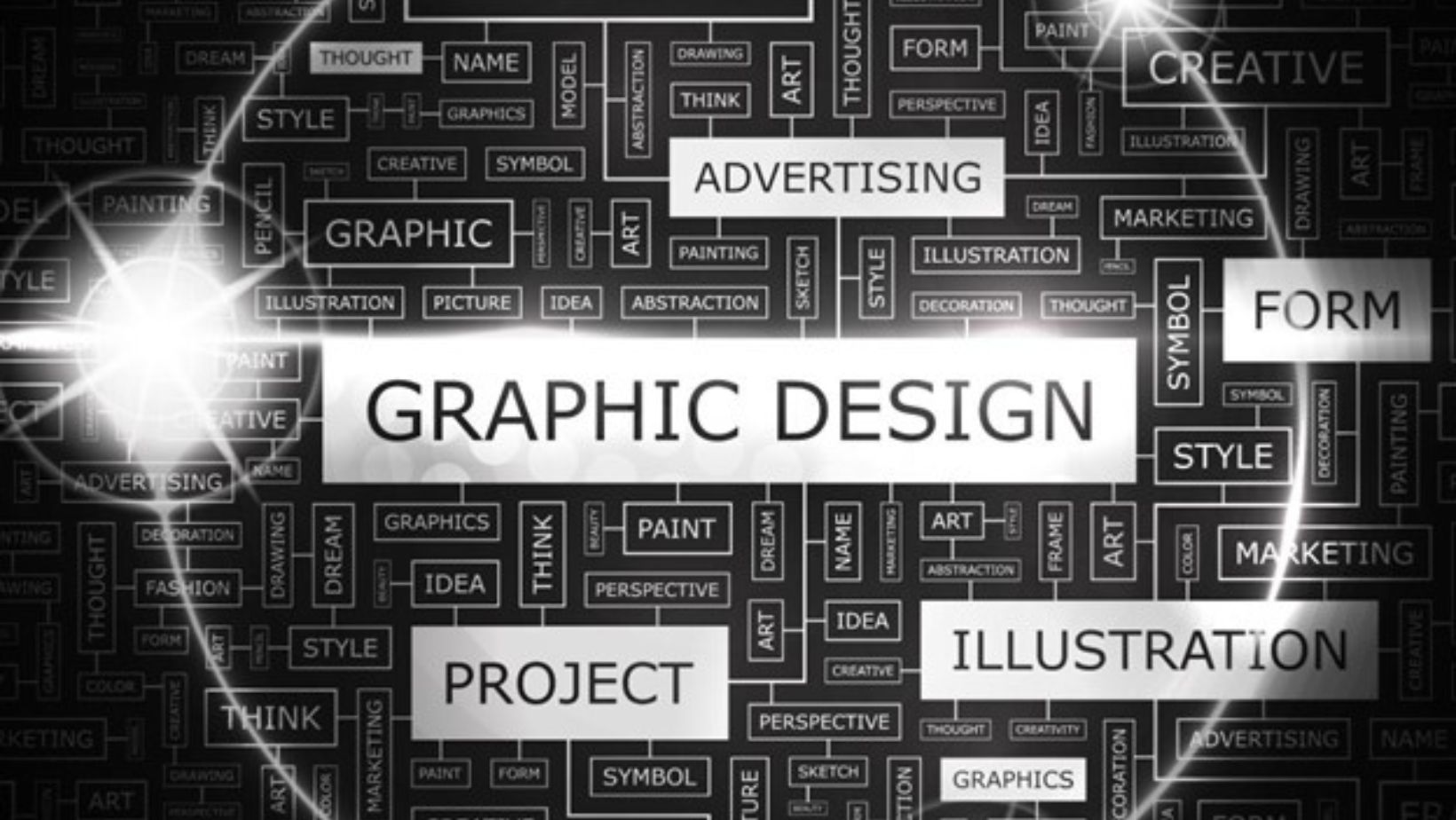
There are multiple branches of visual communication, but graphic design is one of the most appealing choices for beginner creators. It’s enticing for creative minds who enjoy experimenting with unconventional approaches. Does this sound like you? Then, it’s time to delve into the graphic design fundamentals.
While you can explore the 19 different types of design on the Depositphotos blog, this article discusses graphic direction fundamentals and provides key knowledge for becoming a professional in the field.
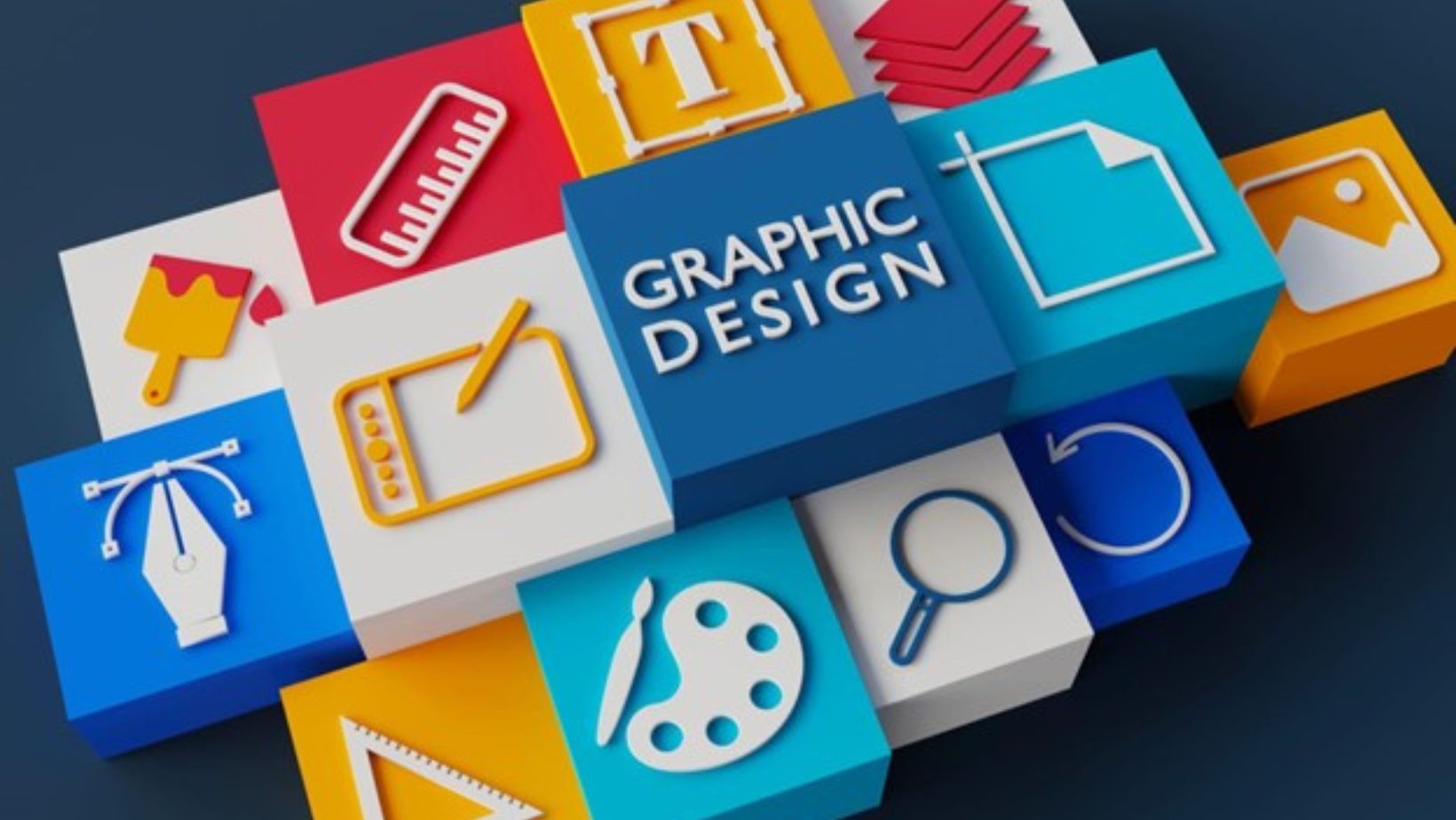
5 Different Types of Graphic Design
Graphic design stands as one of the most in-demand fields in visual communication. Over the past decade, it has demonstrated consistent growth, averaging a yearly expansion of 3.5%. Nonetheless, graphic design encompasses several subcategories from which you can choose.
FAQ: What are the five areas of design?
Design disciplines can be broadly categorized into five main areas: visual, communication, product, interaction, and environmental. Visual design focuses on creating visually appealing images commonly seen in magazines or on websites. Communication design aims to effectively convey messages, often utilizing symbols like a green button to signify the “right choice” in interfaces.
Product design emphasizes the functionality and ergonomics of everyday objects, ensuring usability, like easy-to-hold packaging. Interaction design shapes user experiences, guiding steps to complete tasks, and facilitating decision-making. Environmental design concerns creating comfortable and enjoyable cities and living spaces, such as well-organized workspaces or visitor-friendly parks.
What are the types of graphic design? Below, you can find a comprehensive explanation of its top five branches.
Visual identity design
This type of design is instrumental in helping businesses differentiate themselves from competitors and cultivate strong brand associations with consumers. It involves developing memorable logos, distinctive color palettes, recognizable patterns, and comprehensive brand looks. This direction can be interesting if you’re willing to convey companies’ qualities through visual imagery.
Marketing Design
Marketing design empowers companies to connect with their target audience, which results in strong brand loyalty.
Opting for this direction means you’re responsible for creating landing pages, brochures, ads, social media assets, and more. In marketing design, it’s crucial to grasp what resonates with a specific target audience through research. For example, this can be color preferences and topic interests.
Publication Design
Thoughtfully selected images, meticulously organized layouts, and legible fonts in magazines, e-books, and newspapers are all the work of experts in publication design. You might find this direction appealing if you value orderliness. It’s particularly important in publication design to organize information in a way that’s easy to read.
Packaging Design
This is one of the most intriguing design types because you’ll be in charge of a product’s visual appeal, but also its ergonomics. For example, you may be required to think about how comfortable it is to hold the product. Moreover, you’ll get to play around with shapes and colors to catch consumers’ eyes.
Motion Graphics
Motion graphics is an area of design that requires advanced skills in object physics, video editing, and programming. However, it also allows creative minds to bring complex ideas to life through animation.
The skills of such professionals are in high demand in business, as they can help companies present themselves in unique ways. For example, to animate logos or explain complex products.
To explore further, read various books about types of design. For example, “The Non-Designer’s Design Book” by Robin Williams provides clear insights into four essential design principles: proximity, alignment, repetition, and contrast. By diving into literature, you can acquire knowledge that applies across different design areas, as visual communication rules are universal.
How to Make a Good Graphic: 6 Tips to Follow
To start learning graphic design, the first step is to hone your observation skills. As you browse social media, explore websites, or read books, consider why elements are arranged in certain ways. Reflect on the reasoning behind color palettes and other design choices. Besides, gather examples of designs that appeal to you.
Faq: How Can You Make Good Designs?
To make your designs look good, ensure visual harmony in your composition. For example, this can be achieved through experimenting with the size of your elements. Large components attract attention; you can highlight the most necessary information with them. Small elements help designers create visual contrast and explain key facts more deeply.
Once you’ve acquired theoretical knowledge, try implementing your own pet project—any idea that comes to mind. Firstly, this can give you hands-on practice. Secondly, such projects can be added to your portfolio. During the design process, follow the tips below.
Mind Map Your Ideas
Ideas generation is the toughest part of design, but the mind mapping technique can make this process easier. If you already have visual elements for your project, like a logo or corporate patterns, gather them in one workspace. You can use design tools like Figma or Sketch for this. Take a look at these elements and consider what associations they bring to mind. For example, it could be speed. Thus, such a concept can be represented through blurred graphics. Jot down any ideas that come to you to build a cohesive vision.
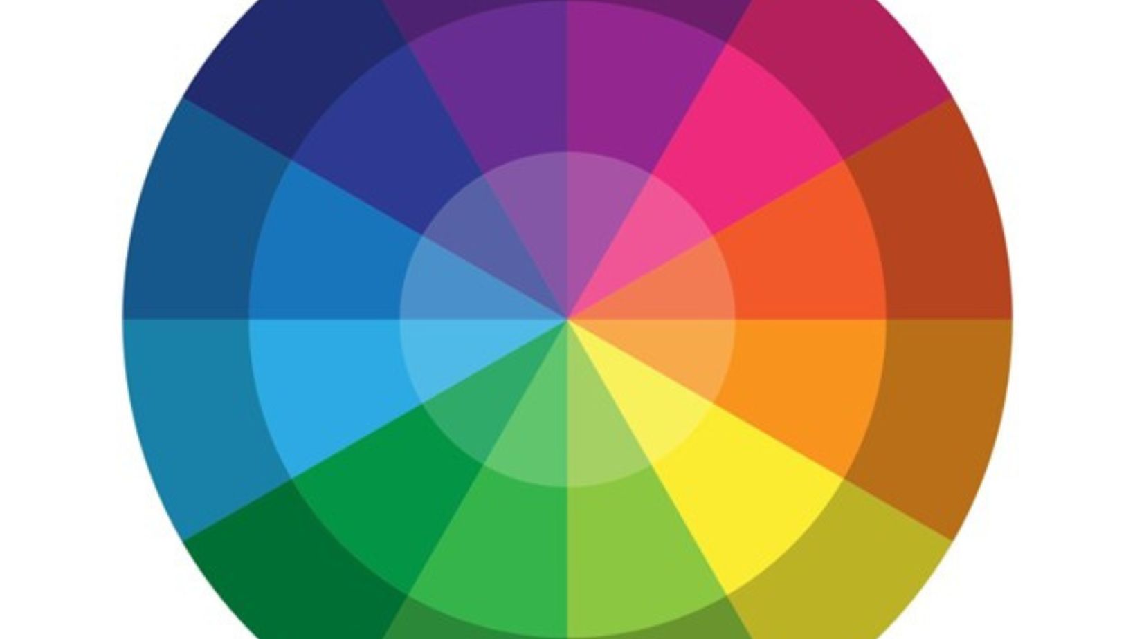
Ensure a Harmonious Color Palette
Color meanings are crucial in design; they can evoke emotions and motivate users to take action. For example, buttons signaling the correct action in interfaces are often colored green because it’s associated with safety. When choosing a palette for your project, start by deciding on the primary hue.

Then, select two or three additional colors that complement it. Online color wheels can help with this process. The key is not to overwhelm your project with too many shades. You can also explore ready-made color palettes on websites like Coolors, Muzli, or Colormind.
Combine Fonts Properly
Across different design eras, fonts have evolved. While ornate typefaces were favored in the past, today’s trend leans towards simplicity. In contemporary graphic design, sans-serif fonts like Helvetica, Roboto, Montserrat, and Open Sans are widely used. Nonetheless, the art of font pairing is complex and requires deep knowledge, which you can acquire from books; one good source is “The Anatomy of Type: A Graphic Guide to 100 Typefaces” by Stephen Coles. The key rule is to stick to no more than three fonts in one project. To find the right combination, you can explore services like Fontpair, Fontjoy, or Type Connection.
Utilize Negative Space
Novices often add too many elements to their projects, which overwhelms them. Such layouts can be difficult to perceive because there’s nothing for the eye to focus on. You should leave some breathing area. For instance, you can achieve this by leaving space on the sides of your project or by adopting a minimalist style.
Stick to Visual Hierarchy
Each object in your design carries its own “weight.” For example, headlines attract more attention than body text, and a shape with a unique color stands out. Consider which information is most important in your project. You can highlight the most significant objects using size, color, and placement.
Organize Your Layers
Though this advice might seem basic, always name each layer in your project. Design work involves handling a multitude of objects, and the more there are, the harder it is to keep track. By following this simple rule, you’ll thank yourself later on.
FAQ: What is the Key to Good Design?
The key to good designs lies in your intention to assist users in achieving their goals. For example, even a simple image can effectively convey key information through color or font size adjustments, enabling viewers to easily locate relevant data. In website development, reducing the number of choices for users simplifies decision-making, in line with Hick’s Law.
Conclusion
Graphic design is fundamentally about caring for the user and conveying thoughts effectively. This can be achieved through the smallest details like fonts, colors, negative space, layout, etc. Practice and cultivate your distinctive style to capture the feeling of harmony in your works.
More Stories
Building a Solid Portfolio: Tips for New Investment Property Buyers
AI-Powered Deal Flow: Can Virtual Assistants Give You an Investment Advantage?
Smart Tips to Reduce Your Energy Consumption at Home